What's Your Design Philosophy? | 매거진에 참여하세요
What's Your Design Philosophy?
#philosophy #design #need #principal #guide #transition #mine
From abstract values to practical guidelines, your design compass starts here.
What Is a Design Philosophy?
A design philosophy is more than a taste for aesthetics — it’s the underlying belief system that drives every design decision.
It answers the “why” behind your “how” and “what.”
It’s the foundation for intentional design — not just decoration.
A design philosophy often reflects the values and principles a designer or organization believes in
: usability, sustainability, accessibility, social impact, or human emotion.
It’s the roadmap that connects function, form, and meaning.
Without a clear philosophy, design becomes surface-level styling.
With a clear philosophy, design becomes a meaningful experience.
Core Components of a Design Philosophy
Every design philosophy is unique, but most consist of three key pillars:
1. Form
Not just how things look — but the design language you believe in.
→ “Form follows function,” for example, is a belief about visual priority.
2. Function
How things work. How they solve problems. Your stance on utility over visual excess.
3. Value
What does this design mean to people and society? What ethical or emotional impact does it carry?
These elements don’t stand alone. They interact, balance, and shape your direction.
Historical Examples of Design Philosophy
🎓 Bauhaus: Functionalism
“Form follows function”
The Bauhaus school, founded in 1919 in Germany, rejected unnecessary ornamentation.
They believed the most beautiful design is the most functional — a principle that underpins today’s minimalism and UX best practices.
From furniture to architecture, their philosophy democratized design, making it useful and accessible.

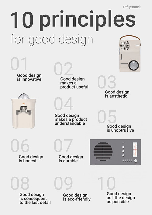
Dieter Rams: 10 Principles of Good Design
The legendary Braun designer proposed 10 principles that continue to influence Apple and beyond:
- Innovative
- Useful
- Aesthetic
- Understandable
- Unobtrusive
- Honest
- Long-lasting
- Thorough
- Environmentally friendly
- As little design as possible

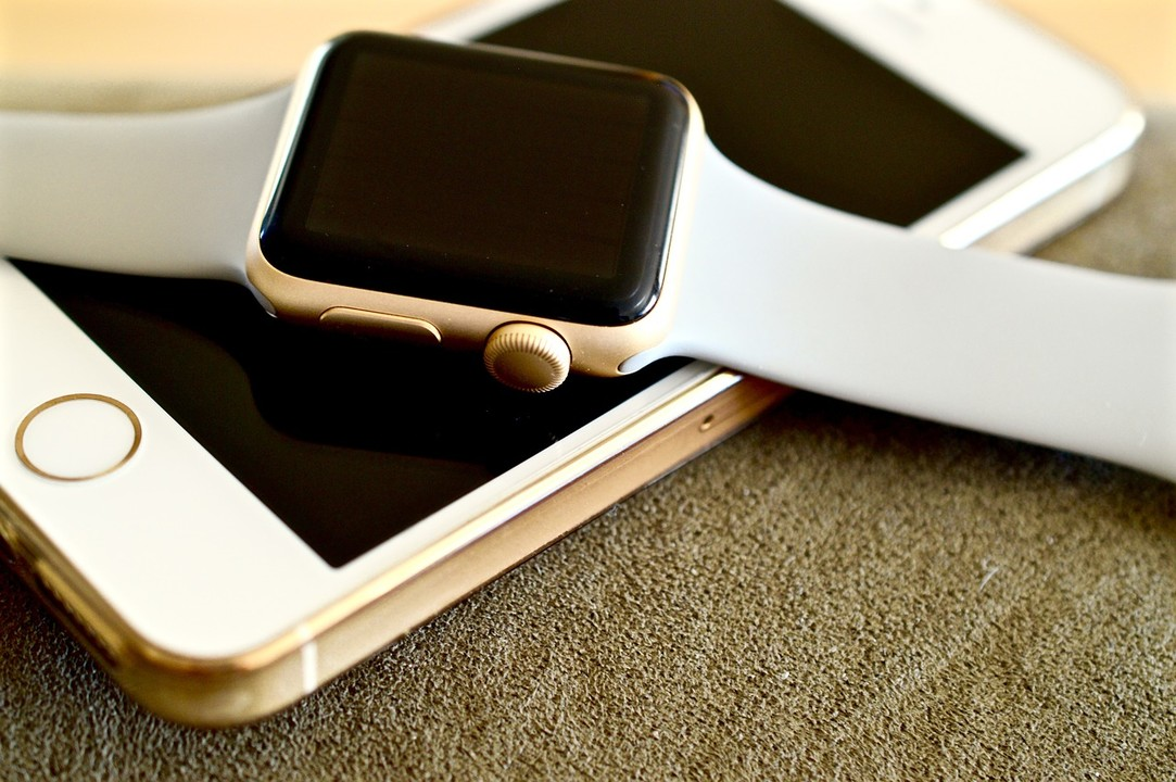
His influence is clear in Apple’s minimalist products — from iPhones to MacBooks — shaped by designer Jonathan Ive.
Contemporary Examples
Apple: Human-Centered Design
Apple strives for a kind of design users don’t even notice. Fewer physical buttons, intuitive gestures,
and clean UIs are all about reducing friction.
"The best interface is no interface."
Early iPhones (one home button) and MacBook trackpads (gesture-based control) embody this quiet philosophy.

MUJI: The Beauty of Nothingness
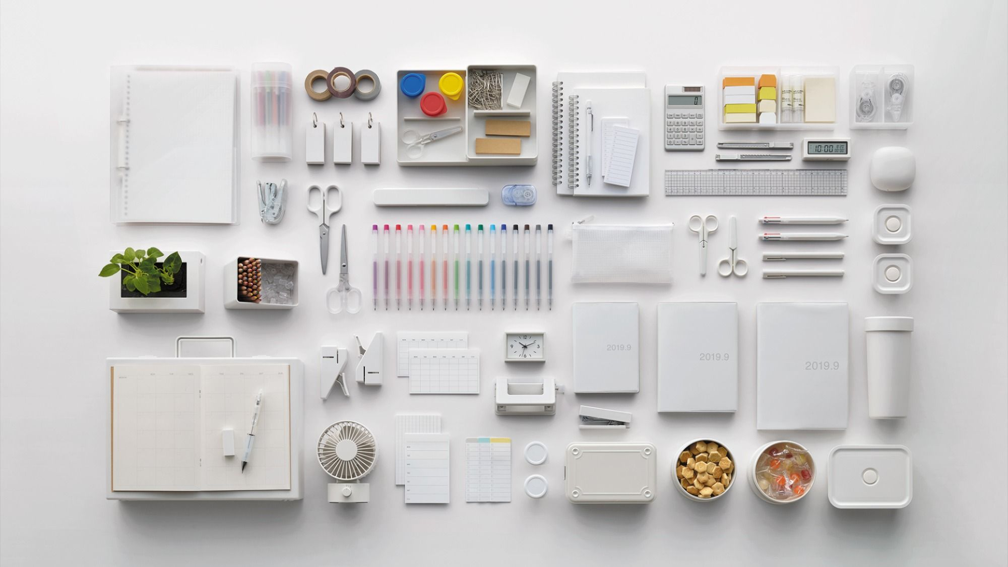
MUJI’s brand centers around subtraction — minimal packaging, muted tones, no logos.
By leaving things out, they leave space for user interpretation. It’s design as a blank canvas — practical, poetic, and deeply personal.

Why a Design Philosophy Matters
Design today isn’t just visual — it’s holistic.
A clear philosophy helps you:
- Maintain brand consistency across all touchpoints
- Align teams around shared design principles
- Build user trust through consistent, intentional choices
How to Define Your Own Design Philosophy
Anyone can design. But meaningful design starts with meaning.
Ask yourself:
- What problems do I want to solve through design?
- What emotions should my design leave behind?
- Do I prioritize beauty, function — or balance both?
- What values drive my design decisions?
Answering these questions is the first step toward your design compass.
Turning Philosophy into Practice
Step 1: Write Your Design Philosophy
Example:
“I believe design should reduce user friction and communicate clearly with minimal effort.”
This reflects a practical blend of Bauhaus and Apple’s human-first thinking.
Step 2: Translate That into Design Principles
Before applying it to colors and buttons, you need translatable principles like:
- Show the most important information first (priority-based layout)
- Eliminate visual clutter; focus on content
- Keep interactions predictable and simple
- Use clear messaging — avoid ambiguous copy
Step 3: Build a Style Guide or Design System
Your principles need UI translations — spacing, typography, button behavior, etc.
A design system helps scale your philosophy across products and teams.
Step 4: Apply It in Real Projects
Example 1: Mobile Scheduling App
Philosophy: Reduce user stress by minimizing interactions.
Outcomes:
“Today’s Schedule” shown on launch
One-button modal to add new items
AI time suggestions to reduce decision fatigue
Neutral UI: grayscale base + 1 accent color
Example 2: Nonprofit Website
Philosophy: Let the message lead, not the visuals.
Outcomes:
Hero section = Large type, no background image
Impact stories in simple card layouts
Text-only navigation
Highly visible donation CTA
Step 5: Use Your Philosophy in Design Feedback
When your philosophy is clear, feedback becomes purposeful:
“This feels too plain.” → “I’m minimizing distractions so users focus on content.”
“Can this button pop more?” → “It’s a secondary action, so we keep it subtle.”
Design philosophy turns debate into alignment.
Final Thought: Your Philosophy Is Your Compass
A design philosophy isn’t abstract. It’s your decision framework when:
- Designers change
- Stakeholder opinions conflict
- A redesign or rebrand is on the horizon
In those moments, your design philosophy becomes your anchor — or better yet, your compass.


